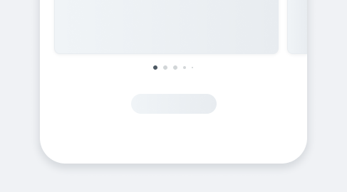
PageControlPage Control provides orientation by showing the total number of items and indicating the currently visible item.
It is most commonly used in components such as galleries, card carousels, and slideshows.
- UX Guidelines
- Overview
- Dev
Usage Examples
Page control display
| Point of reference | Swipe forward (left) | Swipe back (right) |
|---|---|---|
| 1st item | Component Not Supported | Component Not Supported |
| 2nd item | Component Not Supported | Component Not Supported |
| 3rd item | Component Not Supported | Component Not Supported |
| 4th item | ||
| 5th item up to 3rd from the last | Component Not Supported | Component Not Supported |
| 3rd from the last | Component Not Supported | Component Not Supported |
| One before last item | Component Not Supported | Component Not Supported |
| Last item | Component Not Supported | Component Not Supported |
Spec
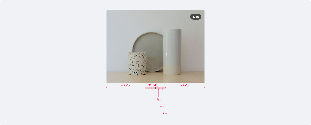
UsageCode Example
<PageControl numOfPages={5} currentPage={0}/>
APIThis is the list of additional props for the component