SelectionBoxSelectionBox contains a collection of items that a user selected from a list of items. It helps the users to easily view the items they selected and remove them.
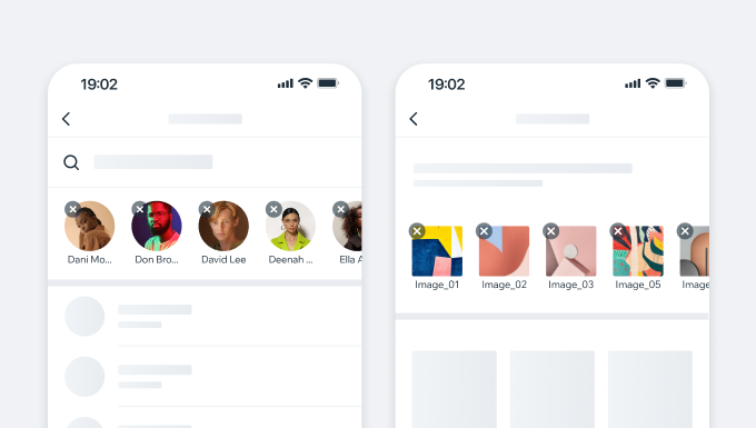
- UX Guidelines
- Dev
Usage Examples
Variations
| Type | Component |
|---|---|
| Avatar |  |
| Media Item | 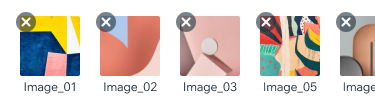 |
| Custom Content | 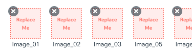 |
Spec
New Item
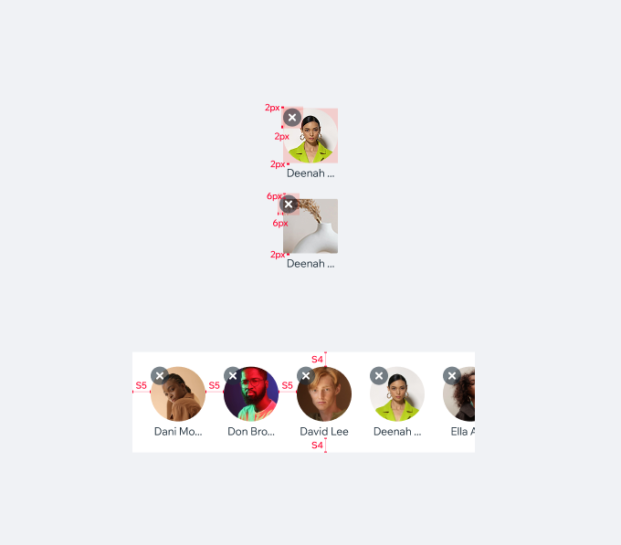
Item size
Recommended size between 60x60 and 80x80. Min 40x40
Text Style
subtext, $textDefault Long text labels get ellipsis.
Horizontal Scroll
If the sum of elements is larger than screen width, the selctionBox becomes scrollable to the side. New items are added last from right.
UsageCode Example
<SelectionBox
  size={60}
  type={type}
  items={items}
  keyExtractor={keyExtractor}
  onItemRemove={onItemRemove}
/>
APIThis is the list of additional props for the component