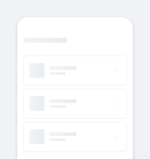
CardUse cards to create layouts and hierarchy in screens.
Cards come in many shapes and sizes depending on the contents inside.
- Overview
- Dev
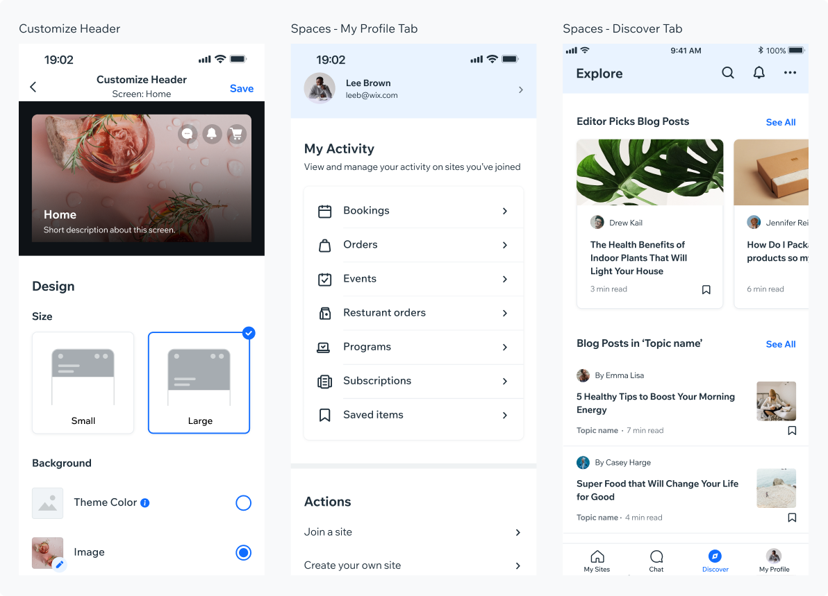
Usage Examples
States
| Property | Component |
|---|---|
| Default BG Color: $backgroundElevated Shadow: sh10 Border: 1px, $outlineDefault |  |
| Pressed BG Color: $backgroundNeutral Shadow: sh10 Border: 1px, $outlineDefault |  |
| Selected BG Color: $backgroundElevated Shadow: sh10 Border: 2px, $outlinePrimary |  |
Spec
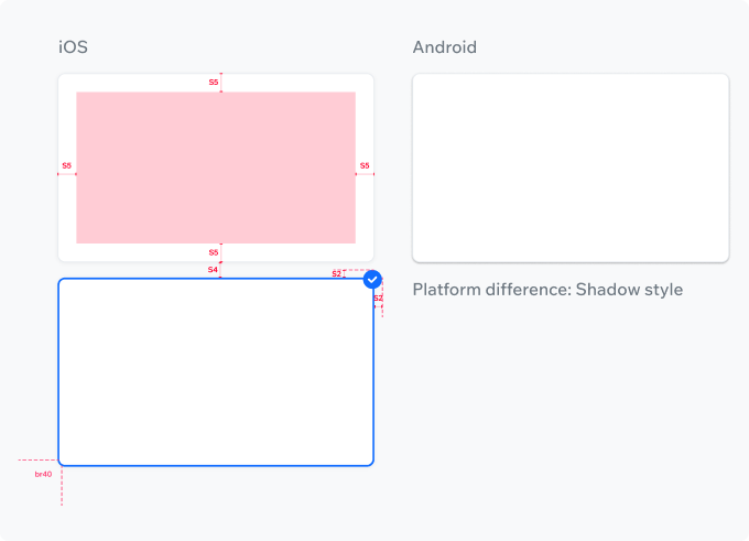
Spacing & StylingInner Padding: S5
Spacing between cards: S4
Border Radius: br40 (default)
PlaygroundCode Example

INFO
This component support margin, padding modifiers.

TIP
This component extends the basic/TouchableOpacity props.
APIThis is the list of additional props for the component