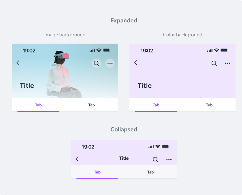
CollapsingHeaderUse CollapsingHeader to create a Cover photo or hero header on your screen.
On scroll, the header contents will fade-out, leaving only the TopBar visible.
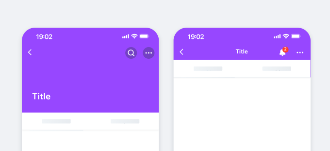
- UX Guidelines
- Dev
Background Type
| Property | Image background | Color background |
|---|---|---|
| Theme Dark | 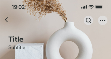 |  |
| Theme Light | 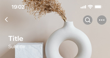 |  |
Header Properties
| Property | Expanded | Collapsed |
|---|---|---|
| Background only |  |  |
| Background + Title |  |  |
| Background + Title + Subtitle | 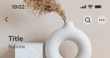 |  |
| Background + Title + Subtitle + Tabs | 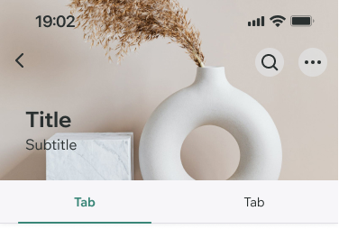 | 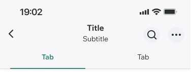 |
Usage Examples
Wix Owner App (Default Style)
Style Configurations
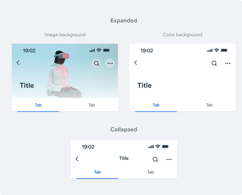
White Style (default)
BG color: $backgroundElevated Title style: Heading, $textDefault TopBar: Transparent TopBar Icons: $iconDefault Image Overlay (optional): White, Medium Intensity
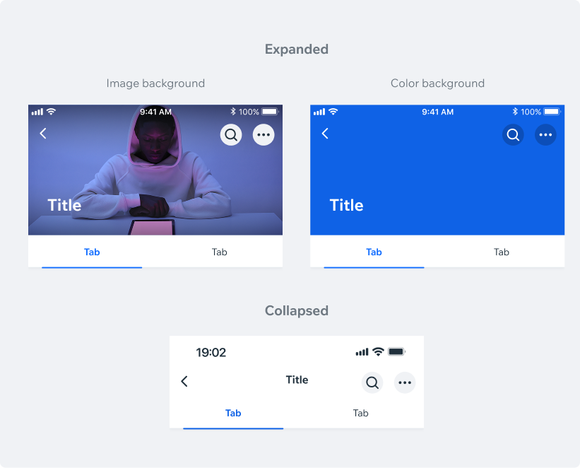
Inverted StyleBG color: $backgroundPrimaryHeavy
Title text: Heading, $textDefaultLight
TopBar: Transparent
TopBar Icons: $iconDefaultLight
Image Overlay (optional): Black, Low Intensity
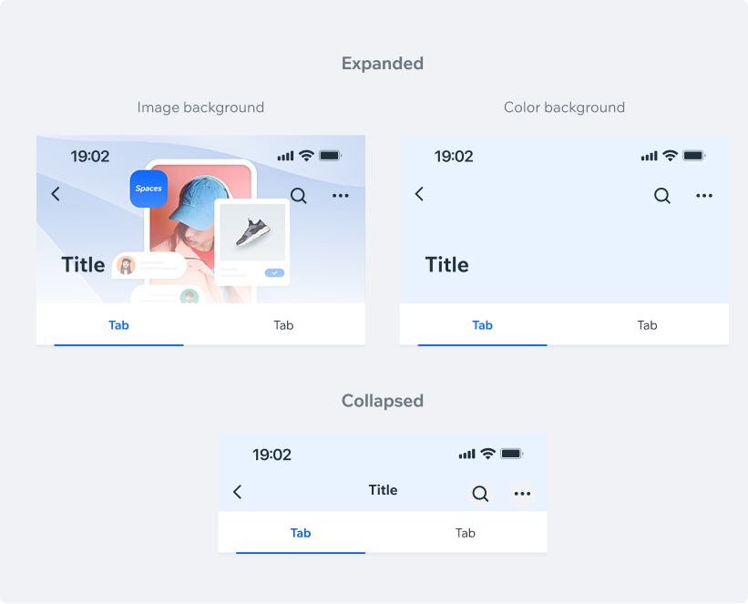
Spaces
Style Configurations
BG color: $backgroundPrimaryLight Title text: Heading, $textDefault TopBar: Transparent TopBar Icons: $iconDefault
Content Variations
Same as in Owner App
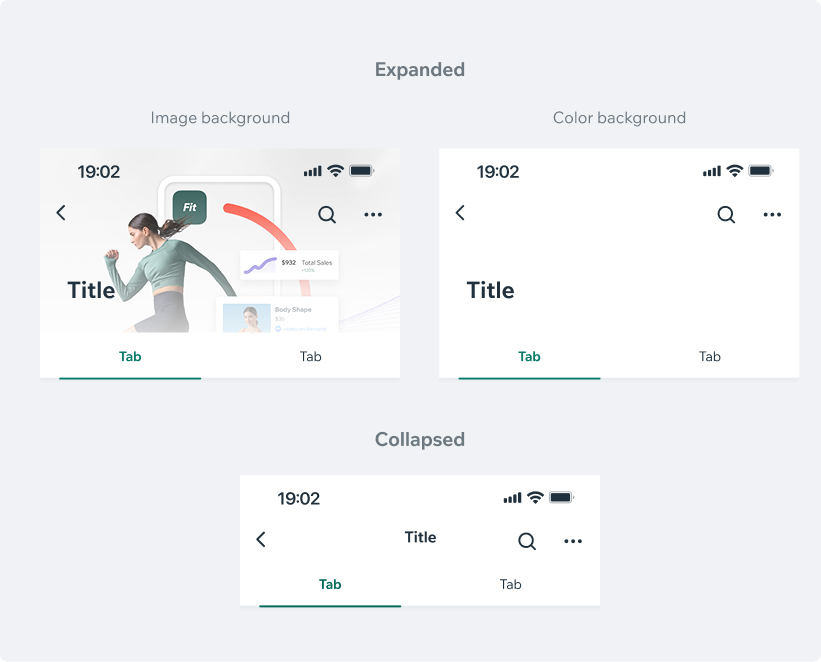
Fit
Style Configurations
BG color: $backgroundElevated Title text: Heading, $textDefault TopBar: Transparent TopBar Icons: $iconDefault
Content Variations
Same as in Owner App
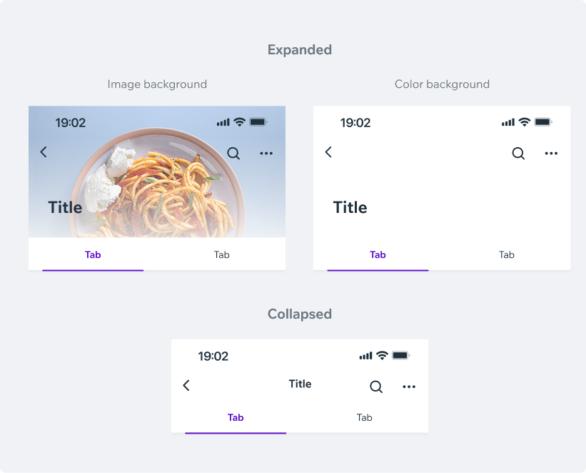
Dine
Style Configurations
BG color: $backgroundElevated Title text: Heading, $textDefault TopBar: Transparent TopBar Icons: $iconDefault
Content Variations
Same as in Owner App
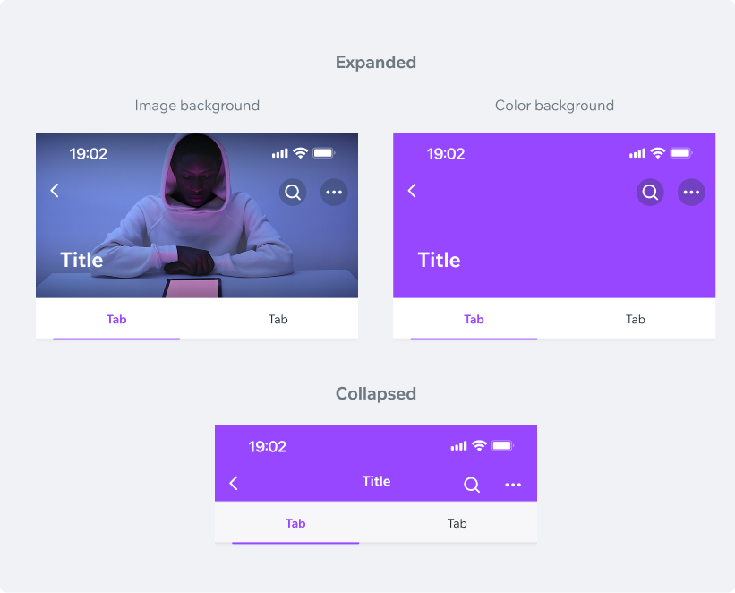
Members Apps (Theme Color)
Style Configurations
Dark Theme
BG color: $backgroundElevated Title style: Heading, $textDefault TopBar: Transparent TopBar Icons: $iconDefault Image Overlay (optional): White, Medium Intensity
Bright ThemeBG color: $backgroundElevated
Title style: Heading, $textDefault
TopBar: Transparent
TopBar Icons: $iconDefault
Image Overlay (optional): White, Medium Intensity
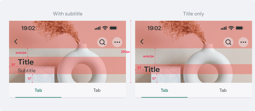
Structure
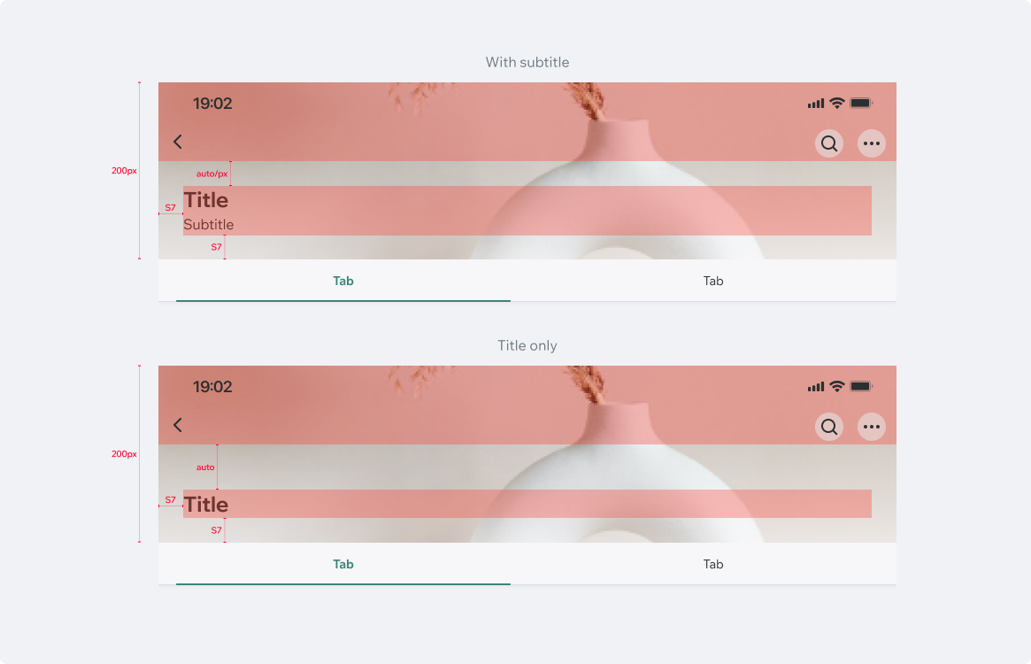
Tablet
UsageCode Example
<CollapsingHeader {...collapsingHeaderProps} ref={collapsingHeaderRef}>
  {renderContent()}
</CollapsingHeader>
APIThis is the list of additional props for the component