TimePickerTime pickers allow users to easily select and set a specific time.
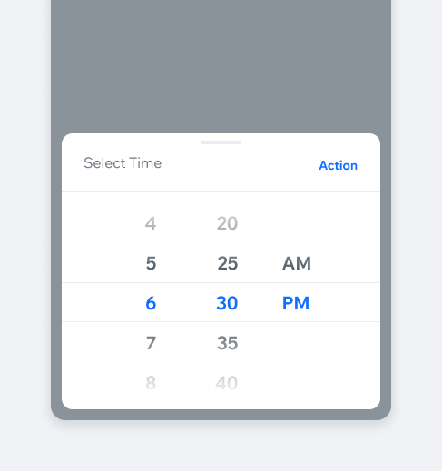
The component consists of the TimePicker field and TimePicker dialog. The field serves as the entry point to the TimePicker dialog.
- Overview
- UX Guidelines
- Dev
Usage Examples
Structure
Time FormatTime picker supports both 12-hour clock and 24-hour clock time formats. The time format will change automatically according to the phone’s settings format.
Field TypesThe timePicker field supports the following types:
| Type | Preview |
|---|---|
| Form | |
| Filter | |
| Settings |
Field States
| Type | Empty | Full |
|---|---|---|
| Form | ||
| Filter | ||
| Settings |
Tablet Spec
NavigationWhen using two pickers (date and time) in sequence, you can automate the transition between them with a “Next” action.
PlaygroundCode Example
APIThis is the list of additional props for the component